Winter Chill | A Color Study
- Caitlin Burch
- Feb 2, 2024
- 3 min read
Updated: Sep 6

Like temperature, the perception of color and how it makes us feel is very subjective. Growing up in Wisconsin I'm familiar with freezing temperatures and more snow than sunshine. Do I enjoy being cold? Absolutely not, it makes me cranky. Thank goodness Winter is just a season. Recently I've become more attracted to lighter tones and neutral palettes. My close friends and family know I love wearing all black because it's timeless. That won't ever change, but I understand why I'm attracted to lighter colors right now, and it's not just to feel warmer. In this post I explore color and how it's linked with our decisions and moods.
In the last year I've grown extensively, while at the same time carrying heavy things that often made personal growth feel impossible. I've had to set down and take inventory of jobs, things, and people in my life in order to keep moving forward. Change is inevitable, but I think we're forced to do it sometimes. So what makes color so influential in all seasons? And why does color feel like something reliable that we use for making choices? It's what our brain associates the color with.

Color is important. In the operating room the drapes that we cover the patient and sterile field with are blue, and so are the scrubs that we wear. The theory of the color blue in surgery is calmness and ease on the eyes under bright surgical lights. Although leaving very little room for any personality in my work wardrobe, the color blue in surgical suites accomplishes a lot more than you think. I'm really lucky I'm not forced to wear orange at work.
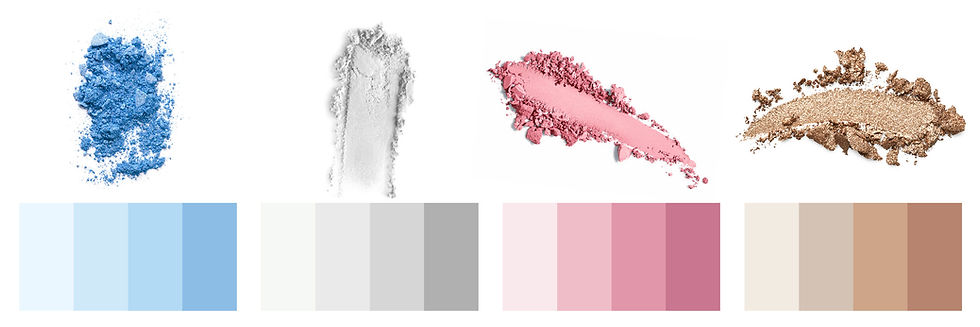
Outside of surgery, I've learned to lean into things that help me feel lighter. I've assembled a few pictures that capture this below. I love simplicity and anything that encourages me not to overthink. Which colors do this for me? Whites + Blues + Pinks + Creams + Grays. I recommend creating a vision board of colors, designs and textures that make you happy. This quick and easy project can be a good tool not just for interior design, but also boosting your mood and revamping a wardrobe. If you don't have an account with Canva now is your time to get acquainted. The variety of elements you can add to a vision board and other projects is endless.
A blend of both science and art, color theories explain the psychology and impact of color. This is why we are drawn to certain products and advertisements, and also how we create and follow trends. To understand more (and to evaluate our closets and homes) let's get familiar with some terms:
Hue: Is the pure or the dominant color found on the color wheel.
Primary: Red, Yellow & Blue
Secondary: Orange, Green & Purple
Tints: White added
Tones: Gray added
Shades: Black added
Value: The lightness or darkness of a hue, tint, tone or shade.
Choosing hues that inspire you, and becoming playful with tints, tones and shades is beneficial in a lot of ways. Whether it's influencing your makeup, clothing or something for your home getting curious with color can be fun. I encourage you to think about what colors you're wearing and why, and also what products you're buying. I think creating an aesthetically pleasing palette is more desirable than having no plan at all.


